Editor's note: Understanding and controlling the tonal and hue transitions is critical for printing images on color areas. Here we come to introduce a few more practical control methods.
Coloring on a dark surface is a problem that every color separation person must face. There are now at least 12 different ways for people to achieve this effect, from simple and solid bases to complex pathway calculations and blending. Most of the methods are effective, but their effects are not the same. Below, I will introduce five different methods to help people create a good white background with less ink, so as to achieve the best color printing effect.
The role of the background
Let us first understand the role of the background. Its role is not only to change the color background of the substrate to white. The real purpose of the background color is to reproduce the tone value of the created image. This concept can be traced back more than 700 years ago. At that time, the master of painting thought that in order to create a picture with vivid colors, the first thing to do was to base the image on the same tone value as the original (original). They may draw a black and white sketch using charcoal before painting. Only when they create perfect black and white images will they begin to paint. This black and white background is actually the skeleton of the image. All images have this black and white basemap. In other words, this is the gray balance of the image.
The purpose of this method is to achieve a smooth black-white transition. If the surface of the substrate is other than black (red, dark blue, forest green, etc.), you will need to integrate the white substrate with the black template to create a natural grayscale image. If the grayscale image doesn't look natural, you'll run into big problems when printing color inks. This is especially true in the wet and wet printing process. The trick to solving this problem is to use enough white.
We have a lot of ways to get white tone information. Some are better and some are worse. You can only decide which approach to take if you know what you want. This is a very complicated issue. The more experienced you have, the more flexible you will be. The technology I share here with you can bring you useful, high-quality backgrounds, but this is not the only solution.
Tone conversion
There are many ways to obtain the hue of an image. Two of the most common methods use the Lightness channel to convert the image to a grayscale or L*a*b color space. This method is more basic, and it can provide users with an operational image.
Grayscale conversion method: first open RGB originals in Photoshop. In the> Image> Mode> Grayscale> Image> Adjust> Invert> Image> Template> Grayscale> Image> Adjustment> Conversion menu, select to integrate each R, G, B channel proportionally to get a suitable The grayscale image then performs the transformation on the image. This method converts a color image into a grayscale image by simulating the human eye's spectral response to red, green, and blue wavelengths.
This method can get a very good grayscale image. Its main advantage lies in its ability to reproduce good detail in dark areas of the image. In the process of generating the background color, an important factor is to smoothly convert the background color to a three-quarter tone and a dark tone region of the image. The enlargement of dots in this part of the black plate may affect the reproduction of details. So you can use the background color to help the dark areas of the image reproduce the details.
The calculation method used by Photoshop can get a brightness - or a reflective background effect. This method is based on the principle of color light subtractive (subtractive model) when light shines on the surface of the substrate. This means that when the light shines on the surface of the substrate, part of the light is absorbed by the color ink on the substrate, and the non-absorbable light is reflected in the human eye. The more light-colored light reflects, the less reflective the darker ones are. This method allows people to get a lot of information about light colors, such as: yellow.
The L*a*b method is also similar, but it can help the user generate images with clearer details, more defined ranges, and stronger contrast between the name and the case. The disadvantage of this method is that it does not perform well on the shadows. To create a background color, select> Image> Mode> Lab, then select the brightness channel; copy the image into a new document, and finally convert the image. One can open the final grayscale and brightness channels and see how these two images differ in terms of tone and contrast. Which method you choose depends on your needs and work experience.
Both of these techniques are better for lighter backgrounds, and the two techniques are a bit overwhelming when it comes to laying out highly saturated dark substrates. Like scarlet, royal blue, maroon, deep purple, etc. are all colors with relatively high saturation but dark colors. Therefore, people feel that white is not sufficient in the background of these colors. If you are printing on a black background, then you have to be much worse in these areas.
To identify possible color problems, use Photoshop's Color Picker to compare color saturation and brightness levels. You can check two different areas in the Color Picker: the "S" and "B" information in the HSB window and the "L" value in the L*a*b window. When you get higher S and B values ​​(close to 100) and lower L values ​​(below 60), the background color of this image does not accurately reproduce the saturated dark background. We can use HSB background to overcome this problem.
The HSB method is not familiar to everyone, but it is very, very powerful. If you use this method, you have to download the HSB/HSL Filter from the Other Goodies Folder folder on the Photoshop installation disk, and then put this folder in the plug-in folder in the Photoshop software. This filter will appear at the bottom of the filter menu in the "Other" option.
Once this folder is installed, you can use this filter on any RGB image. You can choose RGB and convert it to HSB form. This converts the digital information in the three channels of RGB into three channels: hue, saturation, and brightness. So now, the B channel contains the luminance distribution information instead of the blue spectral information. The effect obtained by this method is very strange, but don't worry: we just analyzed the B channel, and it looks normal. The saturated color brightness value is also the color (reflection) brightness value. The B value can be very high, so you must use more white background in these areas. We can find the difference between the two by comparing the saturated color B and L channels. This method will occupy 85% of our time on the background.
Whichever method you use, make sure to convert the image after you have a separate channel. We can save more successful image proofs so that you can evaluate how much white ink they need during the printing process.
The background color generated by these three methods was printed before starting the regular four-color printing. If you use only one kind of background color, it is to print a layer of opaque white ink on the rough mesh. This is exactly the normal halftone printing. For example, if you normally print a color image with a 305-line/inch mesh made of a 34-micron mesh cable, now try a 230-line/inch screen made of a 40-micron cable. A line with a diameter of 54 μm is printed on a 180 line/inch screen, and white can be attached to the color substrate.
[NextPage]
Detail reproduction
Many jobs involving images contain very fine high-light shades, but at the same time pure white can cause problems for people. Even if we use the three methods we mentioned earlier, these problems are difficult to solve. Examples include soft drinks containing ice cube patterns and reflection patterns on alloys.
To solve this problem, we must find other ways to store large amounts of information in very light colors. When you have softer colorants and have limited the range of these colorants, you can reproduce clear image details in some of the softer areas. You need to find the path to capture pure white, and you will It is used exclusively for areas that have a pure white color without any information of other colors. The following two techniques are more useful.
First use the eyedro-per tool to select the purest white in the image. Then use> Select> Color Range and adjust the value of the blurred selector until you reach a satisfactory result. Depending on the image, the appropriate setting is approximately between 25 and 100. Once selected, copy the selected pixels and paste them into a new channel. You will eventually achieve a smooth transition with white and various pastel colors. The Color Range method can generate highly contrast images with clear color separations. In this case, the color tone information is not easy to develop, and it is also difficult to adjust. There is actually a better way to capture information.
Although the second method is confusing, it can bring about ideal results. First, in Photoshop's Color Settings (depending on the software version you are using) menu, select>Working Spaces>CMYK>Custom CMYK to set black compositing. This item is only valid for GCR mode. Since the GCR mode replaces one or all of the C, M, and Y colors with black, the degree of substitution is selected by the item. From the printing point of view, Medium is preferred. For printing and dyeing, when the black is selected to be larger, the C, M, and Y colors will be reduced, and the effect of the softer tone will be more favorable to the clearness of the screen. Then the original RGB image is transformed. Once you have copied the black channel, you will get the information you want. Please note the difference between these two methods and observe how good the hue can be created by the RGB/CMYK inversion method.
No matter which method you choose, you have to finish white after you finish printing all colors. Use transparent white instead of opaque, so that you can print pure white on the brightest part of the image and achieve a smooth transition to the hue. White transparency also helps to reduce dot gain in highlights.
Randomly, the five methods now allow you to produce the ideal background and fine print. These basic methods can take you a key first step. Of course, there are many other ways in the market to improve the printing effect. The key to making a good background is to understand what is the hue and tone transition. The better you perform on tones, the better your background. The rich experience and broad vision are crucial for the print color.
Reproduced from: Wins
PERFECT FOR MULTIPLE USES - you'll love using this gourmet scooper to create beautifully rounded balls of ice-cream, melon balls, sorbet, fruit, frozen yogurt, meatballs, sherbets, rice, popovers, canapes, mashed potatoes, gelatos, perfectly portioned cookies, mini cupcakes, pancakes, hamburger patties, muffins, and many more natural healthy meals, snacks and recipes! Also we will send you a bonus FREE recipe PDF to get you started.
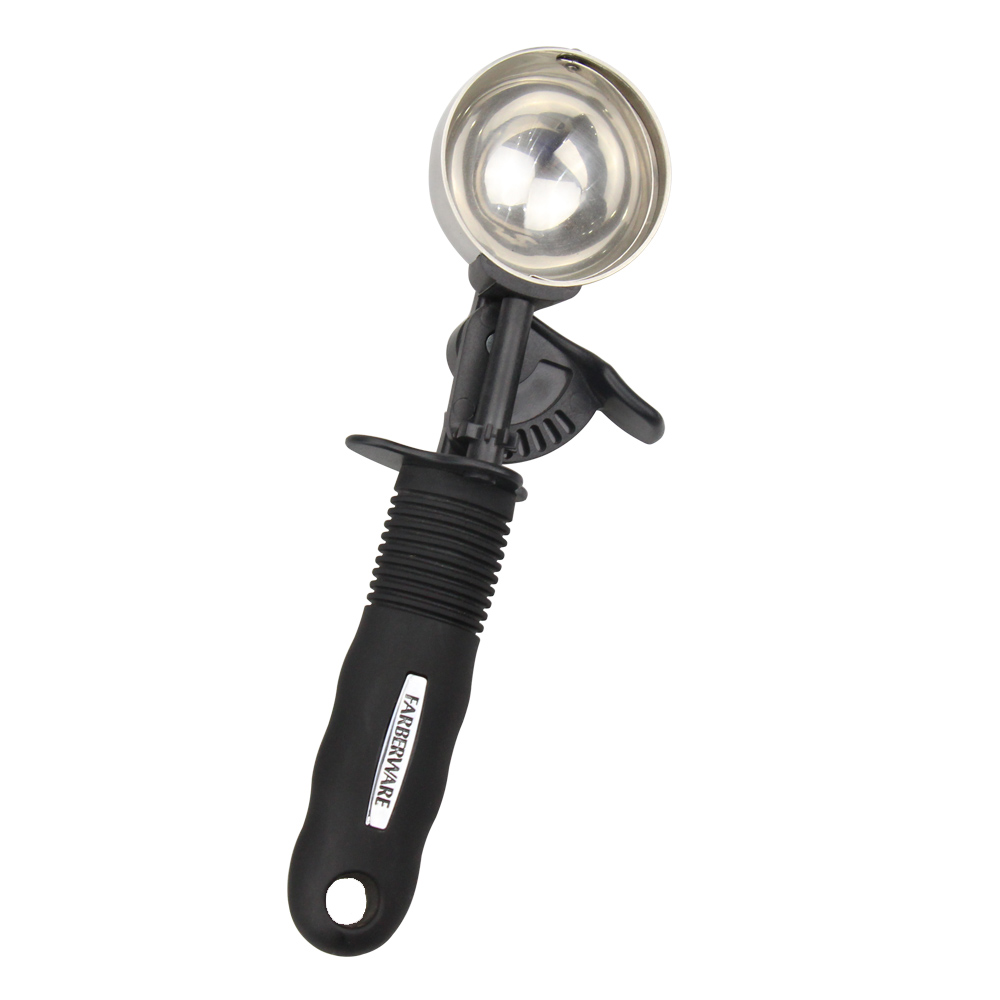
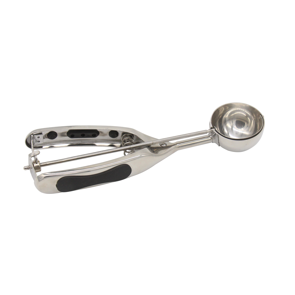
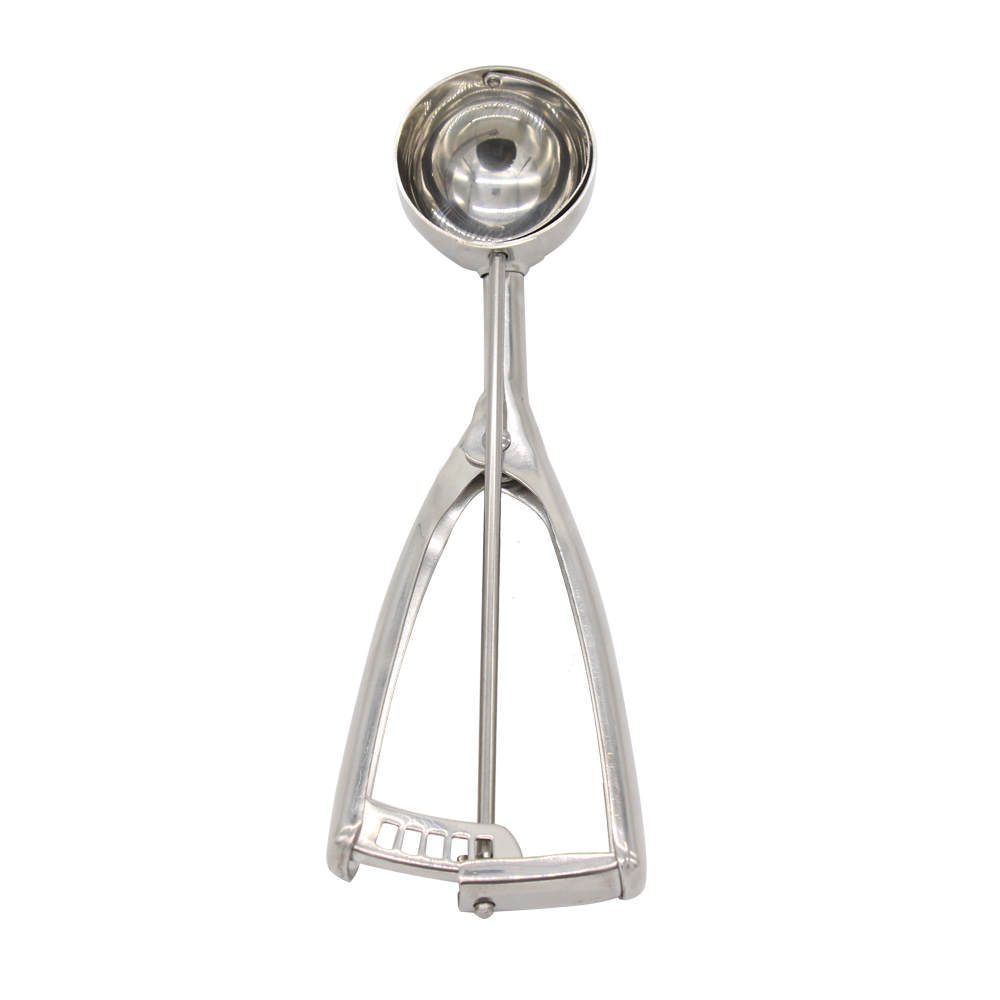
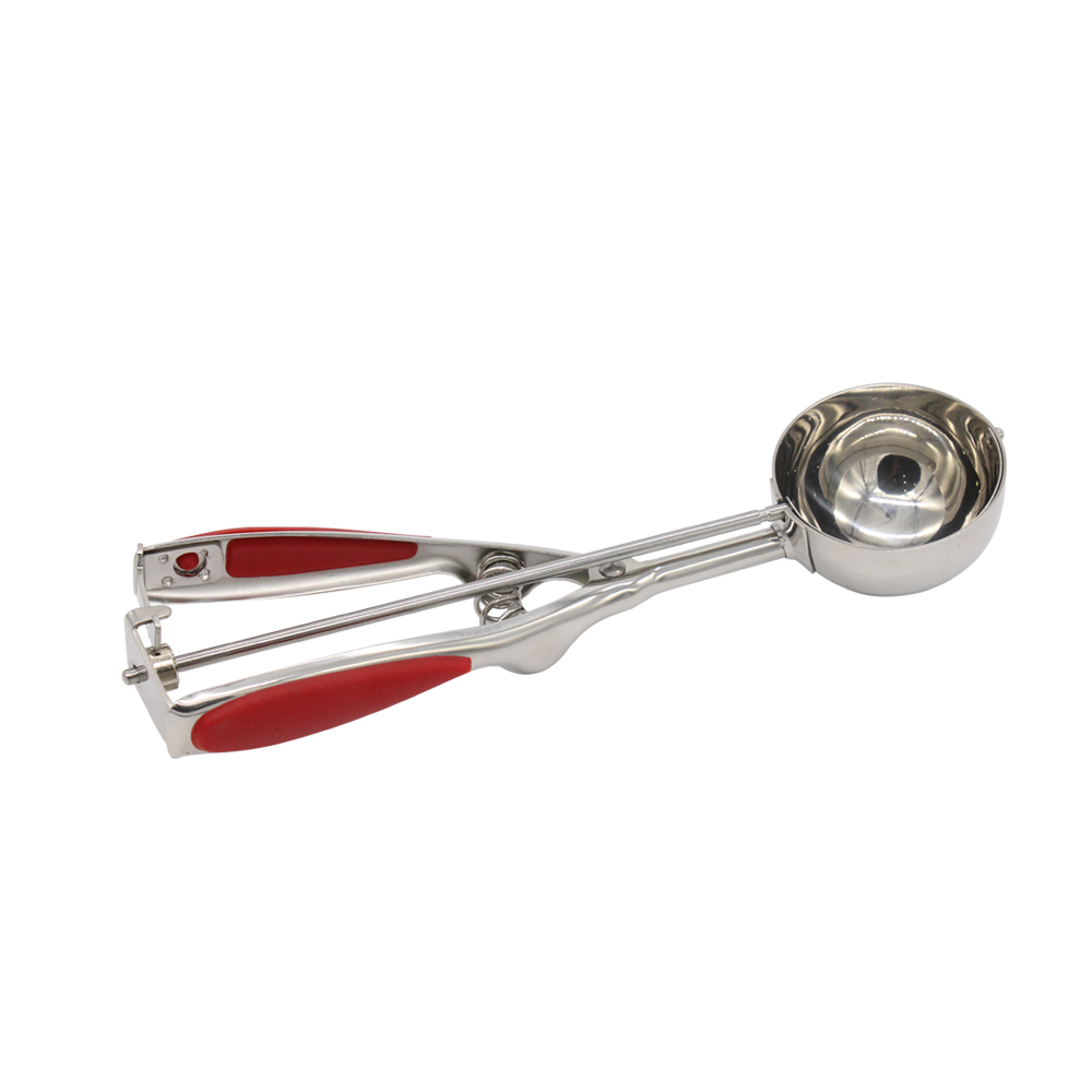
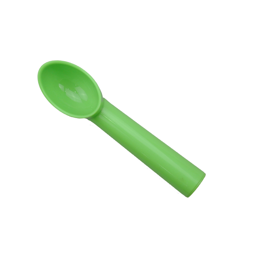
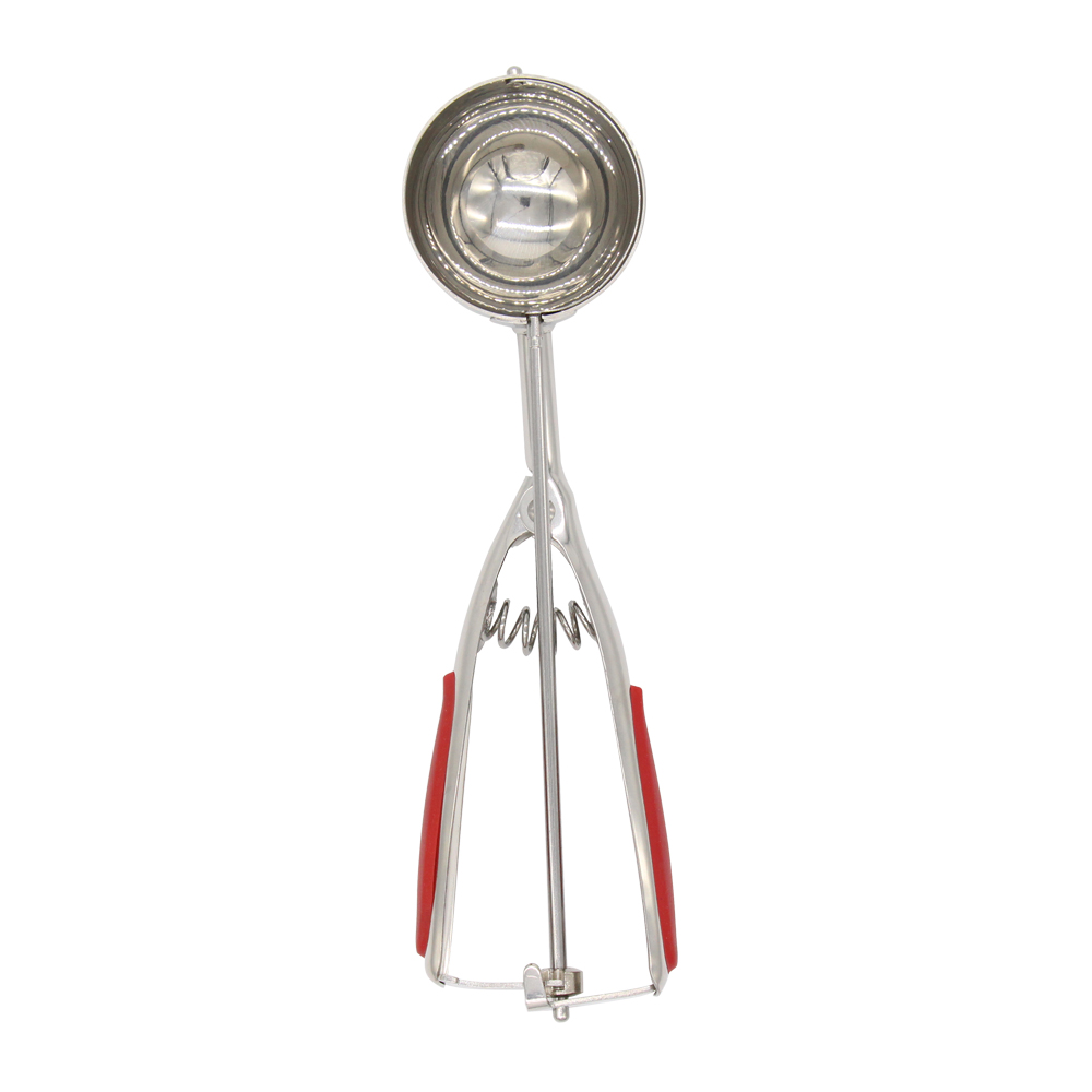
Ice Cream Scraper
YANGJIANG TOALLWIN TRADING CO., LTD , http://www.kitchenknife.de
